
Monday, 21 April 2014

One Easy Trick to Convert Website Visitors Into Leads

Fifteen years ago, I got a beautiful bound journal. I remember the month and year because the first entry in that journal is dated September 21, 1999.
My intention was to journal every day – I've heard from many successful people that the journaling habit is a crucial part of their success formula.
My second and third entries were also from that month. The fourth entry was made in August 2001, and looks like a page of notes from a prospecting meeting. The fifth entry is from 2009.
Clearly my plans for daily journaling had not panned out.
Then, on January 27, 2014, I picked up the journal and decided to get serious this time. Since then, I've written at least a page a day with only four exceptions.
I used a simple trick to turn a source of frustration and shame into a pretty bulletproof habit. And once you understand it, that same trick can be deployed on your website to get more visitors to convert into leads.

Tiny Habits

BJ Fogg, PhD, has developed a system of habit formation called "Tiny Habits." It's kind of the opposite of the New Year's Resolution.
Instead of making a giant, hard change (like suddenly going to the gym three times a week or giving up cigarettes or yes, writing a page a day in a journal), you implement a tiny habit by identifying the ultimate desired behavior and making the very smallest step in that direction that you can possibly make.
Fogg's flagship example is flossing. He notes that people find starting to floss hard. It can hurt, our gums can bleed, it takes a couple of minutes, the floss can get stuck between our teeth, and so on.
Rather than try to increase our motivation for an unpleasant and difficult behavior, Fogg suggests simply making the behavior much easier.
So instead of flossing, here's his formula for a tiny habit: floss one tooth.

Write One Sentence

My new journaling strategy: Every day I wake up and write one sentence in my journal. There's no quality assurance either: I'm fine with, "Here is my one sentence for today."
And here's what happened: I wrote one sentence.
And since I had already opened the journal and uncapped the pen, I wrote a second one. And a paragraph. And a page. It was really helpful to see my thoughts unfold, my insights come out.
Next day, one sentence. And then the rest of the page.
And so it goes. Each day, I write a single sentence. Sometimes that is all I write, if I'm in a rush or not in the mood. But most of the time I write a page or two.

Should We Focus on Motivation or Ease?

Fogg developed "Tiny Habits" after seeing the implications of his behavior model: that behaviors occur given sufficient motivation, ability, and a trigger occurring simultaneously. The harder the behavior, the higher the motivation required. The easier the behavior, the less motivation.
We search marketers spend so much time analyzing our markets, sleuthing our prospects' fears and desires, and honing our copy, that we naturally default to amping up motivation.
The art of copywriting is all about motivating people to action. Features and benefits, social proof, psychological triggers, urgency, scarcity, and the whole toolkit are there to make our prospects want it more.
But search marketing, although a descendant of the old sales letters that tried to sell anything and everything through the mail to the uninterested masses, is actually a very different beast.
Search marketing is driven by desire. I search for "healthy meal delivery" because I already want vegan meals delivered to my home. Yet the ads and websites triggered by my search are spending most of their real estate on convincing me that I want their product.
For example, BistroMD.com has gorgeous food photos and lots of copy about how much weight I can lose easily and deliciously. But their primary call to action is to order a week's worth of food for $159.95.
I don't care how easy it is to receive, store, reheat, and eat their food. Spending $159.95 is hard for most of us when we don't know if it's a good idea.

Inviting Your Website Visitor to Develop a Tiny Habit

Instead of motivating your prospect to do something hard, why not work the other part of the equation: ability?
BistroMD.com could offer a days' worth of food as the first call to action. Cheaper, simpler, less risky. And that one day, if pleasing to the prospect, can easily be converted into a larger habit, just as my single-sentence journaling easily grew to its natural size. Writing wasn't the hard part; starting was.
And with many of our products and services, once folks get a taste, and develop a tiny habit, they'll increase their order size and frequency to its natural dimensions as well.
So next time you try to increase your conversion rate, try this: make one thing easier for your prospect. You may find that approach becomes a habit.

Source: searchenginewatch

Monday, 14 April 2014

Intro to ecommerce website design


If you were thinking about the growth of your business and have decided to start selling your products and services also online then you might want to know a thing or two about eCommerce website design that brings your business to success. The difference between e-commerce websites and regular websites is the features and functions that are required for it and also they are likely to cost you more to produce such a website rather than a regular one. The time spent to plan the e-commerce website is the best investment that you could make and which will guarantee the success of your online business. If you create a good plan then you can save a lot of time, expenses and also do some risk management that will prevent the appearance of future crises.

If you are not savvy with programming and website design, then most likely you will be required to hire someone to do this for you, either in the form of a freelancing website designer or a website design agency. Regardless where you hire the person from, a website designer should be able to give you sound advice and assistance so that the final design of your website is also the suitable one for your brand. Before deciding what person to hire ask the applicants to send you their portfolio and study their projects with attention and the way they build e-commerce websites before.

The most important aspect of your e-commerce website is for it to look professional and trustworthy. You are in a business and business means an exchange between you and your target audience. If the seller doesn’t look trustworthy, then of course that people will not spend their money there as they would be afraid of being cheated. This is why the last part of the feedback process is to ensure that the website designer you work with creates a professional look for your e-commerce business.

Source: siliconindia

Tuesday, 25 March 2014

How to Delete Negative website Reviews from search engine: Safe Brand


If you have not been proactively checking your brand online, then this is the right time to do so. With the advent of the internet, most potential customers will probably do some "Googling" or searching about your site in the internet before actually visiting your site to purchase whatever products or services you offer. This is where the tricky part comes in; without you knowing, some irate customer or competitor might have written something negative about your site, and it is showing in Google's top page or any other search engine result. This literally kills your sales even before it actually starts and you are unaware of it.

Think of what other potential customers will do when they see that particular review about your company.

Word of mouth takes a new trendy courtesy of the internet, and with how fast one can access the internet, your company might be losing millions of sales and even prospective suppliers who can give you discounts. So what are you going to do about it?

Do Your Research
Your company's brand is its most treasured asset. It is therefore crucial that you take matters in your own hands and that starts with researching yourself. Search your company for keywords that you want to be found. If you find a negative review about your company, then you might want to talk with the moderator if it is a forum or the web administrator to have it pulled down especially if the reviews are false or accusatory. More often than not, contacting the web master or moderator would resolve the issue.

Worst Case Scenario
The worst thing that could happen is if the moderator or web administrator refuses to pull down the review. This can happen especially in forums or review sites where the moderators have limited powers to do so. If this happens to you, then you can try out several of the tips below before you launch a lawsuit against the reviewer. A lawsuit is not only costly but also ineffective as you would lose valuable time and money that you can re-allocate elsewhere.

What to do?
If the webmaster refuses to remove the negative review, you can ask them what to do to overturn the review. More often than not, they would suggest some options including contacting the reviewer and remedying the problem. If the reviewer refuses, you can comment on the site and explain your side of the story so other viewers would be able to know your side and judge you for that.

One of the best things that you can do is to polish your company's image so that the cracks will appear so small that nobody would bother checking it out is to join professional networks in your industry and make connections not only with your peers but also with prospects that are interested in your product and services. Aside from professional networks, you can also open a social media network for your company such as a FB page or a Twitter account. The two sites have a high percentage of users and since these rank high in terms of authority, they can pass some link juice and also help push down the negative review to oblivion.

Another thing to do is to make use of some reciprocal links with other websites in your industry. This is especially effective if the site is considered an authority site in your niche. Google loves sites that link to relevant sites. Do not link with other sites outside of your industry as this would look spammy and Google might slap your site with penalties.

Copyright Notice: Readers may use the content online and solely for their personal, non-commercial use, provided all links are active with no changes to the syntax, do not remove, modify, copy, frame, reproduce, sell, publish, transmit, display or otherwise use any portion of the content without the express consent of the author.

Saturday, 1 March 2014

The Basic Element of Professional Website Designing

Easy Navigation

When customers lands on your site, they should be able to find what they need with a few simple clicks. Keep their attention by making their choices easy! Try these tips when planning your professional web site:
  • Drop down menus. These work well for keeping all the information in one convenient place.
  • The basic essentials. An "about us" page and a clear "contact" page will go a long way toward helping your customers find out more about you. Do your visitors need to get in touch quickly? Consider an email form for their convenience.
  • Click and shop. If you are selling products on your site, make the "buy" buttons large and clear. Keep your shopping cart and checkout process smooth and easy, with dedicated buttons for every option along the way.

Professional Web Design Should be Consistent

From the background of your website to the titles of individual web pages, consistency is key. Your professional web design can be an integral part of building your brand, but only if you offer a consistent message. How can you do that?
  • Use the same colors. Choose a color that suits what you want to project. For instance, vivid colors on a fashion design site are excellent, but if you are selling mobility equipment, you might want to go with a more serious palate.
  • Choose appropriate graphics. Your graphics and photographs should all come from the same place and have the same style. Focus on your brand logo and make certain all surrounding graphics support that central theme.
  • Watch out for fonts! One of the most common mistakes in web design is the use of different fonts on various pages of the website. Keep your fonts consistent throughout, so your customers dont have to adjust to something new with every click.

Keep it Simple, Sweetie

It can be easy to get caught up in flash screens, fun widgets, and other addictive bells and whistles. But dont lose sight of the fact that at the end of the day, simplicity in web design can appeal to a much wider audience.
  • Offer content at a glance. Websites designed on a grid pattern are very popular, and for good reason--grids make it easy to digest your content in sections. Think of an old-fashioned newspaper layout. There is a reason this classic way of presenting information still works today!
  • Keep your grid pattern "above the fold." Have you ever noticed how most successful websites have their search function, order buttons, and navigation at the top of the page? Put the most important information on top and dont make your visitors scroll for what they need.
  • Stay easy on the eyes. Flashing lights and glittery backgrounds are the marks of amateurs. Choose a simple color scheme, or better yet, go with a monochromatic scheme that offers contrasting colors to catch the eye.

Keep in Touch

That "little extra" goes a long way in any line of business, and the same holds true for your professional web design. So give your visitors that little something that keeps them on the page longer.
Add a blog to your website and keep it updated on a regular basis. Offer links to an RSS feed, bookmarks, and an internal search function. These simple additions can keep your website on the customers mind, and that means they might visit more frequently.

Exclude No One!

Your website should be accessible to anyone, anytime, anywhere. Make certain your customers can connect with you on their own terms.
  • How does it look? Check your website in all browsers before the launch and after every update. Tweak your website design until it looks great across all platforms. Start with the most popular browsers, such as Internet Explorer, Firefox, Safari, and Chrome. Dont forget to test it on iPads and iPhones, too.
  • Reroute with style. Design 404 error pages to redirect quickly, with no effort from the visitor. Adding a bit of quick humor on the page--"You stumbled into our construction area!"--might bring a smile from your visitors in the few seconds it takes to redirect, and that can only be a good thing.
  • Offer a toolbox. Give your visitors the tools they need to view your content. For example, if you offer documents or reports in a PDF file for download, also offer a button that allows your visitor to download the PDF reader for free.

Professional Websites Load Fast

Professional website design keeps speed in mind. If visitors have to wait for a page to load, they are much more likely to go elsewhere. Less than two seconds of load time per page is usually recommended to give your customers the optimum browsing experience. The faster you are, the more likely they will stay--dont give them time to think about clicking over to your competition!

Monday, 23 December 2013

Best Web Designing Frameworks for 2014

Starting a new year could hardly get any better for web designers than this.
We have some of the best and most powerful web designing frameworks just waiting to be explored. These are frameworks that can help you build fully functional web templates within minutes and with extremely minimal knowledge of CSS and JavaScript coding.
There are great expectations for the year 2014. Responsive websites are already the Next Big Thing. Visitors from mobile and tablets have become an important factor for all websites. Every website has to look good and work well in every device.
In this article, we will list some of the best CSS frameworks that will help web designers and developers to explore their potential to build responsive and beautiful web applications in 2014

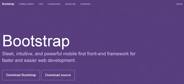
Twitter Bootstrap 3

Bootstrap
Whether you want to design a personal portfolio, a business website or a shopping cart, Twitter Bootstrap’s flexible and responsive capabilities will come in handy in all cases. It’s more than just a mere set of CSS and JavaScript rules, Twitter Bootstrap has within it an inbuilt responsive powerhouse. With many new features added to the third version of Twitter Bootstrap, it has once again proven that it is here in the web industry for the long run.
The JavaScript components of Twitter Bootstrap help you to design sliders that can run in any kind of device. Components like Modals, Dropdown, ScrollSpy, Tab, Tooltips, Popovers and Carousels are some of the best things you will like about Twitter Bootstrap.
You can start learning Twitter Bootstrap 3 today and make your web experience far more better in the year 2014. Try Twitter Bootstrap 3.

Foundation Framework

Foundation
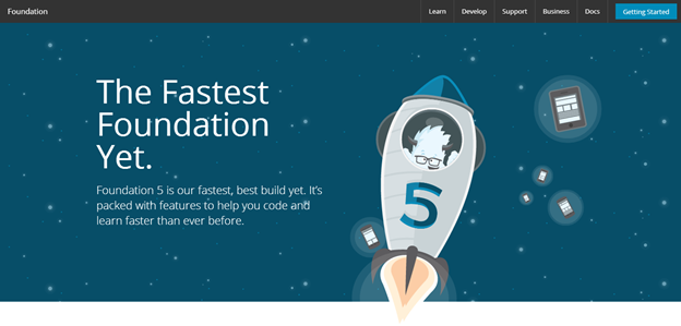
Foundation Framework by Zurb has emerged in the second half of 2013 as one of the best frameworks for web designing with its version 5.0. With features similar to that of Twitter Bootstrap—and some significant enhancements—it is expected to climb the ladder of popularity in 2014.
Foundation framework boasts a 12 grid system similar to Twitter Bootstrap. It also provides reusable HTML components and JavaScript plug-ins in its package. But unlike Twitter Bootstrap, Foundation has support for Sass stylesheets. You need to compile the Sass stylesheet, convert it into normal CSS files and then use them in your project. Adding Sass support makes it more customizable for designers who want to give that personal touch to the websites.
With features like Off Canvas and Improved form, it would be interesting to see web developers explore this framework to the most in 2014. Refer to Tahir Taous’s article to know what’s new in Foundation 5. Try Foundation 5.

Gumby Framework

Gumby
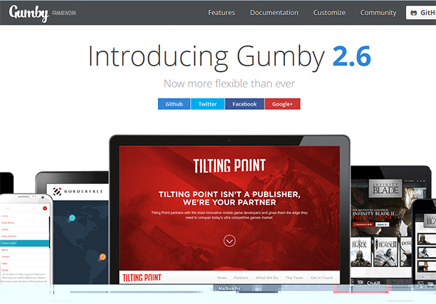
Gumby Framework is built on a Sass preprocessor that allows you to customize and build designs on top of the Gumby Framework. Designing with Gumby will require you to understand the basics of Sass. It can be customized by changing the variables values using Sass. Modular scale is another great inbuilt feature of Gumby that uses a Golden Ratio tool for typography.
Just like Twitter Bootstrap 3, Gumby framework provides support for Internet Explorer 8 and above and all the open source modern browsers.
Continuing with the industry standards, Gumby also has the 12 grid layout system. It logically divides the browser’s space into 12 grids and supports nested gridding. Some new concepts like Hybrid Grids, Tiles, Fancy Tiles and Semantic Tiles make this framework unique and definitely worth trying. Reusable CSS and JavaScript plugins are also provided by Gumby Framework. Try Gumby Framework.

Yahoo Pure CSS

Pure
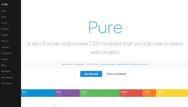
Yahoo Pure or Pure CSS is a lightweight CSS framework by Yahoo. It’s both extremely light and also responsive in nature. Unlike other frameworks, Yahoo Pure doesn’t have any JavaScript Plugins.
This framework also utilizes the popular 12-grid-layout system and has its own CSS rules to apply. For people who like the metro design of Windows, Yahoo Pure is the perfect CSS framework to start designing with. It promotes less shadow effects and almost no rounded corners in its designs. Yahoo’s skin builder can be used to customize the look when using Pure CSS.
Yahoo Pure CSS is perfect for developers who would like to stick to their respective framework but like to use the flat design. To achieve this, you have to just include the CSS file that is provided in the CDN by Yahoo. Try Pure CSS.

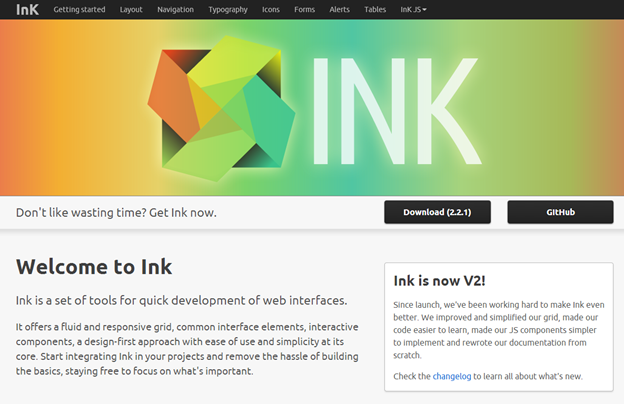
InK Interface Kit

Ink
Being new to the industry and having learned from its seniors, InK provides solutions that most people could be looking for. It has both reusable HTML and JavaScript Plugins. The most unique feature in this framework is the ability to provide drag and drop support—which is still not present in Twitter Bootstrap 3, for example.
InK provides an amazing set of form validation classes which comes in very handy. Image processing is also another power feature. Using InK you can create multiple versiona of the same image and reduce the load time in various device types. It also has an impressive set of MIT licensed icons to play with.

Read More: http://www.sitepoint.com/best-web-designing-frameworks-2014/

Designing Traditional Websites vs. Inbound Marketing Websites

As a designer, I always want to design a site that not only looks good, but is easy to navigate and provides a good user experience. With designing a traditional website I can probably stop there, be happy with myself and crack open a celebratory beer.

But times have changed with the growing adoption of Inbound Marketing, which has completely affected the way I approach a design when that project lands in my inbox.

So what is the big deal?
Content is King.

The biggest difference between traditional websites vs. inbound websites is that inbound sites are much more focused on the content, leading the user to action, and getting results. In short, the idea is that your visitors will be driven to eat up all the great content your site provides (like videos, e-Books, whitepapers, infographics, blogs, etc.), turn into leads, and ultimately convert into loyal customers. The main denominator of this idea is content.

So for me, I need to make sure that the content (marketing message) is getting through loud and clear to the user. I need to make sure that I engage them visually without distracting them from the marketing message. And I also need to guide the user through the website.
Simplicity and Usability are Key.

Most people searching and researching online know what they are looking for and want it now. If they can’t find what they are looking for on your site pretty quickly then guess what? As Sweet Brown once said, “Ain’t nobody got time for that!” There are literally gazillions of other places on Google that people can search to find what they want. So why should they stick around on your site?

On an inbound marketing website, everything on your site needs to be intuitive to the user. Your site should be easy to navigate. Also, your calls-to-action and offers should not only be attractive but be clear to your audience. You probably want people to be able to easily contact you, right? Give them the information they need without requiring extra clicks or scrolling. Is your site responsive? Why not? All of these elements and more really come down to making your website simple and easy to use.

And these elements are imperative if you are thinking about designing an inbound website, probably not so much for the traditional websites of old.

From my experience, creating a website design with these factors in mind can be pretty difficult; that’s why I put together a handy infographic with Inbound Web Design tips.
The Future is Now.

Designing Traditional Websites vs. Inbound Marketing Websites image inbound webdesign blog sideTraditional websites are fast becoming part of the past. The year 2014 is fast approaching. Your site is the most accessible gateway to your business and the services you provide. Fact: 89% of US internet users search online before they make a purchase, even when the purchase is made at a local business (- HubSpot). Make sure you put your best foot forward and get results.

If you have not thought about inbound marketing for your business by now you probably should. Start thinking about your customers, how your business can help them, and make a lasting connection with them. It is no longer about making a website that just looks cool with no substance; your site and the content you provide needs to have a soul if you want people to stick around.

Curious about what inbound can do for you and your website? Are you ready for a change in the New Year? Contact the experts here at for all you Inbound marketing and website needs.

Read more at http://www.business2community.com/online-marketing/designing-traditional-websites-vs-inbound-marketing-websites-0708843#z500f4GeTyuxivzY.99

Thursday, 17 October 2013

Best SEO Firms in India is Cyberworx.in

With a rise of firms realizing the worth of net promotion, it's become very vital to possess top of the range SEO services at low costs. A standard downside that a lot of internet masters wear down is that the high fees of the standard program improvement services. With none alternative choices left, they'd to compromise with high costs to date. And consequently solely a number of businesses may have afforded the large charges.

Particularly the little organizations and therefore the lone entrepreneurships intimate with the foremost because the massive players of the corporate accustomed wean them of potential customers. straight away their computer, because of low status and inconvenience of quality program improvement services at lower fees, might ne'er bring home the bacon their market and consequently they were destined to oblivion.

However the condition has an incredible different with new SEO corporations in Asian nation. With innumerable program selling services blooming in Asian nation, currently you'll reach bent nice SEO corporations in Asian nation. These program improvement specialists of Asian nation square measure already triple-crown in an exceedingly temporary time owing to the superior optimizing services and timely receiving an equivalent.

The SEO corporations of Asian nation make sure that you get associate degree unmatched service that may generates the right have an effect on on your web site and consequently has the best have an effect on on your guests. They consider the fundamental foundation of your business, your goods, services and particularly your prospects. With a rise of technological innovations and enhance in Asian nation, the program improvement consultants square measure utterly able to meet all of your program improvement desires. the combo of tailor-made thought and therefore the correct skills they provide you assist you get higher ratings within the several search engines together with those that square measure most viewed.

The SEO corporations in Asian nation develop a particularly skilled methodology. the first job of a number of the triple-crown program improvement specialists is to do to perform web site analysis and therefore the analysis for your journal. By victimisation off page/on page improvement, plenty of them additionally give you with the good thing about hot articles for your computing machine that may be printed keeping the location audiences and your target customers in mind. Owing to the cheaper fees that they supply, you'll currently use outsourcing for all of your program improvement necessities to SEO corporations in Asian nation. With prime quality SEO services accessible at vast discounts, currently you'll be happy that your own website} would possibly see the sunshine of day once rising variety of shoppers and customers are often pushed to your site.